Glassmorphism 2.0 in practice: how to create the frosted glass effect with CSS without freezing the interface
Learn to apply Glassmorphism 2.0 with modern CSS, maintaining high performance and excellent usability in web interfaces without freezing the screen.
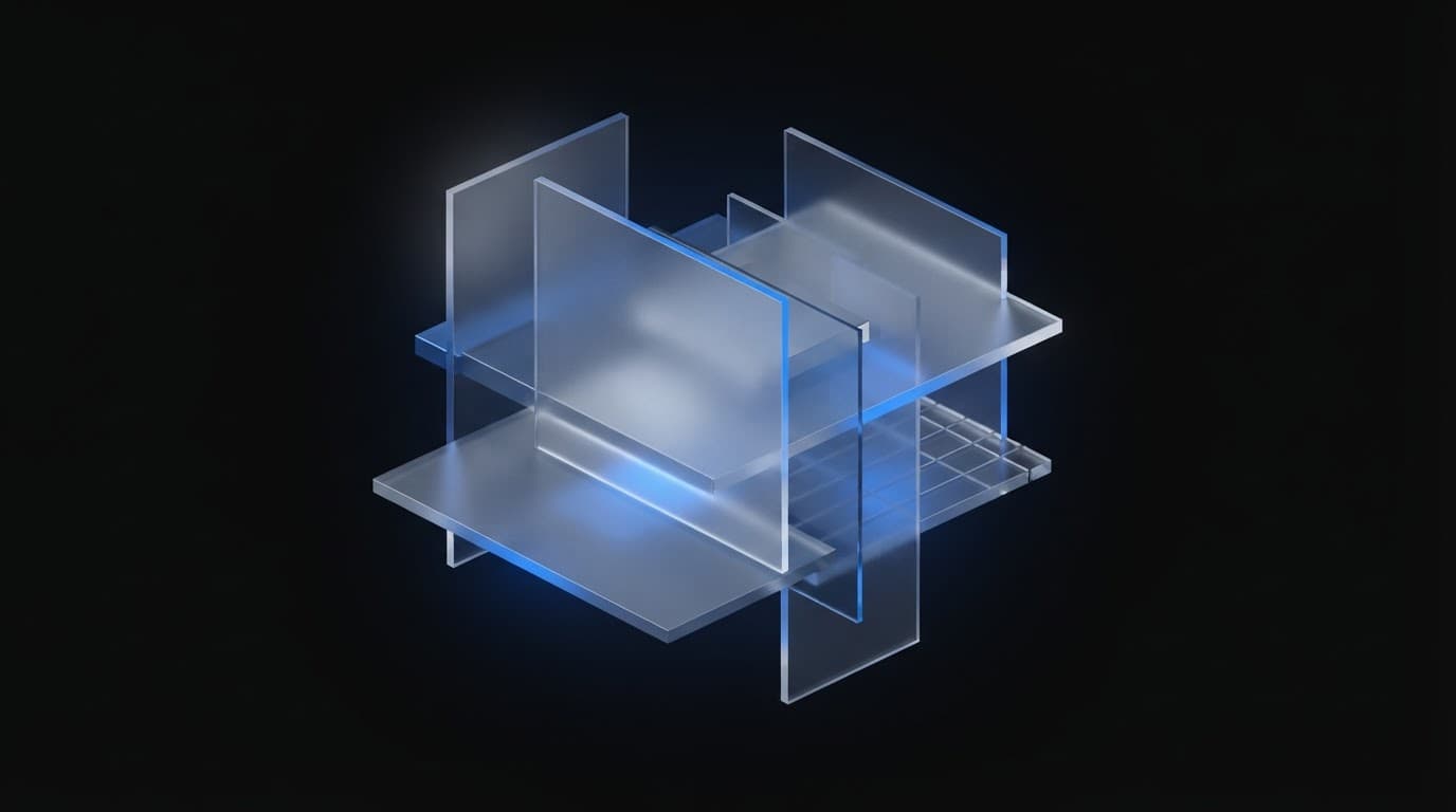
Glassmorphism 2.0: the enhanced return of the translucent interface
Learning how to create the frosted glass effect with CSS Glassmorphism and building elegant interfaces without compromising screen frame rate and browser performance is fundamental for any modern project. The frosted glass effect, widely popularized in digital interface design, resurfaced in 2026 with an enhanced version called Glassmorphism 2.0. Unlike the previous version, which relied on a simple blur, this new iteration delves into how light interacts with digital materials, using more refined CSS techniques for a realistic and impactful result.
If you are a front-end developer or interface designer, mastering this trend requires understanding the balance between aesthetics and code optimization. In this complete tutorial, we will detail how to implement Glassmorphism 2.0 in practice with CSS, focusing on relative color syntax, gradients with mask-image, and the strategic use of backdrop filters in multiple layers, also covering performance and accessibility limits.
Key points
- Style Evolution: understand the structural differences between traditional Glassmorphism and version 2.0.
- Essential Syntax: learn the CSS recipe with
backdrop-filter,rgba, and subtle borders to create the effect. - Ideal Parameters: discover the recommended adjustments for blur, opacity, and visual saturation.
- Full Compatibility: ensure browser support by using the
-webkit-backdrop-filterprefix for Safari. - Performance and Accessibility: learn the essential precautions to avoid interface freezes and ensure good readability.
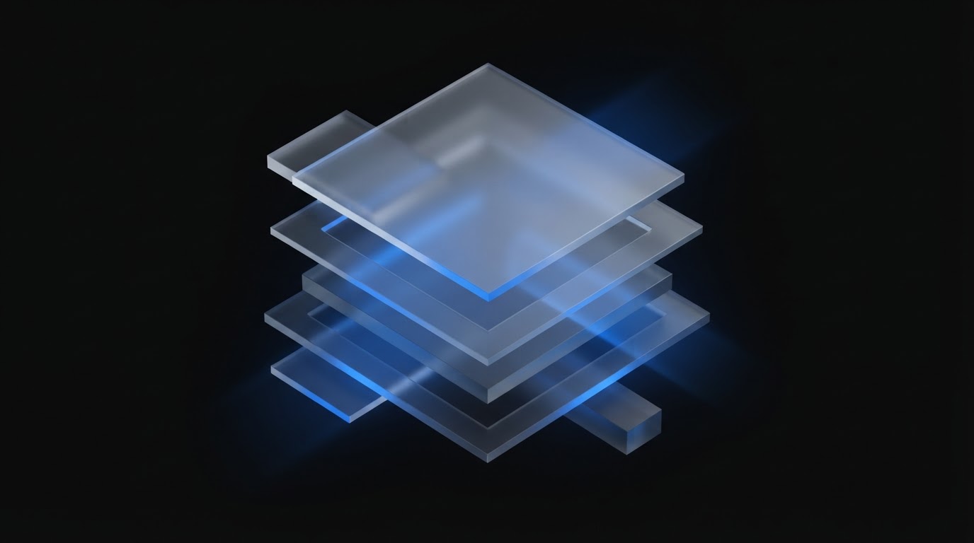
The essential recipe: how to create the frosted glass effect with CSS Glassmorphism
The Glassmorphism 2.0 effect relies on three fundamental pillars in CSS: the use of backdrop-filter to apply blur to what is behind the element, transparency controlled via rgba, and the addition of a subtle, low-opacity border to define the element's outline. This combination creates the illusion of depth and a translucent look that mimics real materials.
The basic recipe for an element with the Glassmorphism 2.0 effect is as follows:
.glass-element { background: rgba(255, 255, 255, 0.07); backdrop-filter: blur(12px); -webkit-backdrop-filter: blur(12px); /* For Safari compatibility */ border: 1px solid rgba(255, 255, 255, 0.18); border-radius: 20px; box-shadow: 0 8px 32px rgba(0, 0, 0, 0.2);}Let's detail each property involved in this structure:
background: rgba(255, 255, 255, 0.07);: defines an almost transparent white background. The low opacity (0.07) is crucial for the content behind to be visible and for the transparency effect to work naturally.backdrop-filter: blur(12px);: is the magic property responsible for blurring everything positioned below the element in the page's background.-webkit-backdrop-filter: blur(12px);: an indispensable declaration to ensure compatibility with the Safari browser and iOS devices.border: 1px solid rgba(255, 255, 255, 0.18);: adds a very thin semi-transparent border, simulating the reflection of light on the edges of cut glass.box-shadow: 0 8px 32px rgba(0, 0, 0, 0.2);: projects a soft shadow to highlight the component from the background and give a sense of three-dimensional elevation.
Comparison: Glassmorphism 1.0 vs Glassmorphism 2.0
Understanding the technical leap between the two iterations helps make smarter choices when coding your system's interface.
| Feature | Glassmorphism 1.0 | Glassmorphism 2.0 |
|---|---|---|
| Visual Technique | Basic uniform blur | Multiple filter and saturation layers |
| Light Treatment | Static background | Directional gradients with mask-image |
| Color Management | Fixed rgba() values | Relative color syntax in modern CSS |
| Hardware Impact | High re-draw without isolation | Optimized layers for GPU processing |
| Accessibility | Low contrast without fallbacks | Dynamic adaptation for high contrast and reduced motion |
Design Insight: The great secret of Glassmorphism 2.0 is not to increase the blur radius, but rather to combine light refraction, asymmetrical borders, and strict control of the opacity of the lower and upper layers.
Advanced techniques: relative colors and mask-image
Version 2.0 of the effect elevates the level of realism by utilizing recent features of the CSS ecosystem. Instead of relying solely on static rgba colors, it's possible to take advantage of relative color syntax and intelligent masking.
Relative color syntax for dynamic themes
With CSS's relative color syntax, you can define the glass transparency based on system variables, automatically adapting the element to light and dark modes:
.glass-dynamic { background: rgb(from var(--bg-surface) r g b / 10%); backdrop-filter: blur(16px) saturate(180%); -webkit-backdrop-filter: blur(16px) saturate(180%); border: 1px solid rgb(from var(--border-color) r g b / 20%);}The inclusion of saturate(180%) in the background filter is one of the touches of version 2.0: it brightens the colors of the elements passing behind the glass, avoiding that grayish or faded appearance.
Gradients and masking with mask-image
To simulate an irregular glass surface or with directional lighting, we combine gradients with the mask-image property:
.glass-card { background: rgba(255, 255, 255, 0.08); backdrop-filter: blur(14px); -webkit-backdrop-filter: blur(14px); border-radius: 16px; mask-image: linear-gradient(135deg, black 70%, transparent 100%); -webkit-mask-image: linear-gradient(135deg, black 70%, transparent 100%);}This soft mask smooths the component's bottom edges, creating the impression that the translucent piece is merging with its surroundings.
Essential care for performance and GPU
Despite the impressive visuals, backdrop-filter is one of the most expensive properties for the browser's GPU (graphics processing unit). When poorly implemented, it can cause sudden drops in frame rate (FPS) during page scrolling.
To keep the interface light and fluid, follow these optimization guidelines:
- Avoid applying the effect to long lists: do not place
backdrop-filteron dozens of individual items on the same screen. Instead, apply the effect only to the parent container. - Isolate the rendering layer: use the
will-change: transform;property cautiously only on animated elements with a glass effect to force the browser to create a separate layer on the GPU. - Maintain moderate blur radii: values between 8px and 16px offer the best compromise between visual elegance and processing speed.
- Offer a fallback without blur: for older devices or when the transparency feature is disabled by the operating system, provide a solid fallback color.
@supports not (backdrop-filter: blur(1px)) { .glass-element { background: rgba(18, 18, 20, 0.95); }}Accessibility: readability first
One of the most common mistakes when using frosted glass is neglecting text contrast. Transparency can cause readability issues depending on the image or content passing behind the panel.
To keep your component accessible and within international guidelines:
- Text Contrast: ensure a minimum contrast ratio of 4.5:1 between the text and the intermediate background color of the glass.
- Reduced Motion Support: respect user preferences by disabling complex transparency effects if they prefer a simplified interface.
@media (prefers-reduced-motion: reduce) { .glass-element { backdrop-filter: none; -webkit-backdrop-filter: none; background: rgba(20, 20, 25, 0.92); }}Frequently asked questions
How to create the frosted glass effect with CSS Glassmorphism in Safari without flaws?
To make the frosted glass effect work perfectly in Safari, it is essential to include the -webkit-backdrop-filter property along with the standard backdrop-filter version. Additionally, ensure that the element does not have properties that break the stacking context of layers in iOS.
Does CSS's backdrop-filter consume a lot of phone battery?
Yes, excessive use of backdrop-filter requires continuous GPU processing to recalculate the blur for every pixel moved on the screen. To save battery, use smaller blur radii and apply the effect only to modals or specific fixed headers.
How to ensure text readability over frosted glass?
Slightly increase the background opacity to values around 0.10 to 0.15 and use text shadows (text-shadow) or bold font weight. Testing the interface with light and dark backgrounds is fundamental to confirm contrast.
Conclusion
Glassmorphism 2.0 is a mature evolution for those who want to create modern, sophisticated, and highly attractive interfaces without sacrificing usability. By combining backdrop-filter, precise opacity, and masking techniques, you achieve a refined, high-quality professional result.
To put your learning into practice today, select a secondary component of your project, such as a floating card or navigation menu, and apply the basic CSS structure presented in this guide, ensuring accessibility fallbacks.

About Lee Sugano
Lee Sugano
Digital solutions agency based in Japan, serving clients in 10+ countries. We share insights on development, design and digital marketing for companies that don't settle for generic.
Enjoyed this content?
Receive exclusive insights about web development, design, and digital marketing straight to your inbox.
No spam. Unsubscribe anytime.