Glassmorphism 2.0 na prática: como fazer o efeito vidro fosco com CSS sem travar a interface
Descubra como implementar o Glassmorphism 2.0 com CSS, utilizando backdrop-filter e outras técnicas para um visual moderno sem comprometer a performance ou acessibilidade.
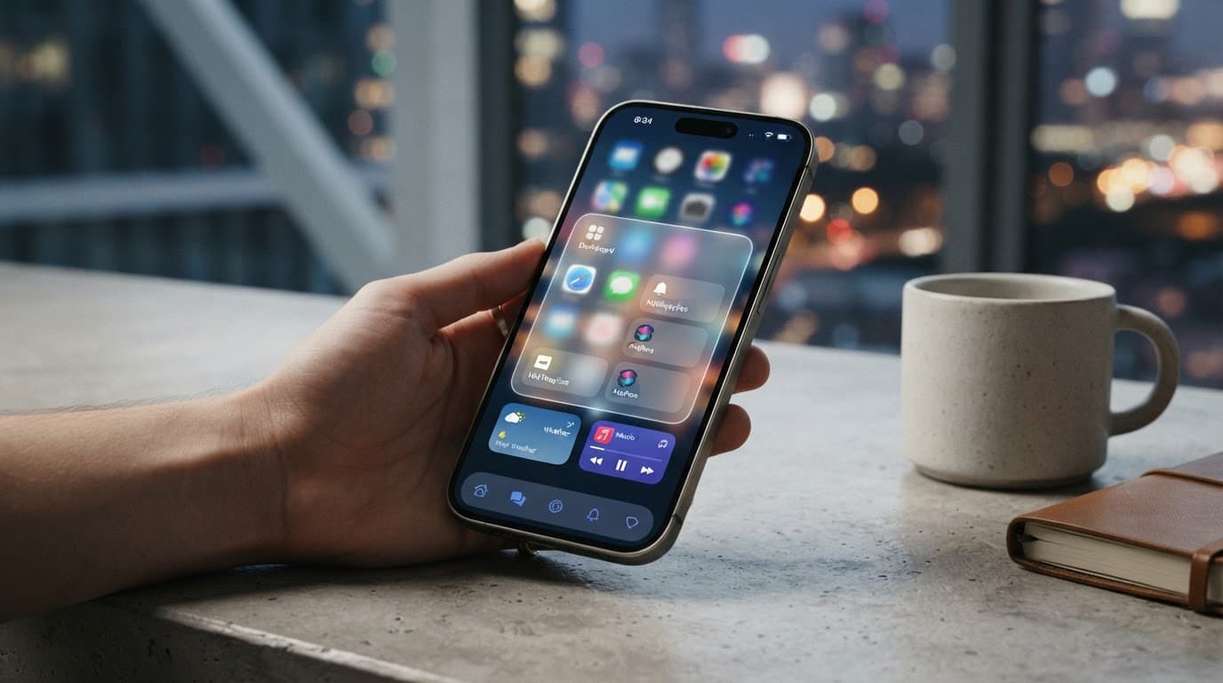
Glassmorphism 2.0: The Triumphant Return of the Frosted Glass Effect
User interface (UI) is constantly evolving, and with it, the search for visual elements that bring modernity and sophistication without sacrificing usability. Glassmorphism, that effect that mimics frosted glass in digital elements, re-emerged in 2026 with an improved version: Glassmorphism 2.0. Unlike its predecessor, which relied on simple blurring, this new iteration delves deeper into how light interacts with digital materials, using more refined CSS techniques for a realistic and impactful result.
If you are a front-end developer or interface designer, get ready to master this trend. In this tutorial, we will detail how to implement Glassmorphism 2.0 with CSS, focusing on relative color syntax, gradients with mask-image, and the strategic use of backdrop filters on multiple layers. Additionally, we will address performance and accessibility limits to ensure your project is beautiful and functional.
Key points:
- Understand the evolution of glassmorphism to version 2.0.
- Learn the CSS recipe with
backdrop-filter,rgba, and subtle borders. - Discover the ideal parameters for blur, opacity, and saturation.
- Ensure compatibility with the
-webkit-prefix for Safari. - Know the essential considerations for performance and accessibility.
The Foundation of Glassmorphism 2.0 with CSS
The Glassmorphism 2.0 effect is based on three fundamental pillars in CSS: the use of backdrop-filter to apply blur to what is behind the element, controlled transparency via rgba, and the addition of a subtle, low-opacity border to define the element's outline. This combination creates the illusion of depth and a translucent look that mimics real materials.
The basic recipe for an element with the Glassmorphism 2.0 effect is as follows:
.glass-element {
  background: rgba(255, 255, 255, 0.07);
  backdrop-filter: blur(12px);
  -webkit-backdrop-filter: blur(12px); /* For Safari compatibility */
  border: 1px solid rgba(255, 255, 255, 0.18);
  border-radius: 20px;
  box-shadow: 0 8px 32px rgba(0, 0, 0, 0.2);
}
Let's detail each property:
background: rgba(255, 255, 255, 0.07);: Sets an almost transparent white background. The low opacity (0.07) is crucial for the content behind to be visible and the effect of

Sobre a Lee Sugano
Lee Sugano
Agência de soluções digitais com base no Japão e clientes em mais de 10 países. Compartilhamos insights sobre desenvolvimento, design e marketing digital para empresas que não aceitam genérico.
この記事が気に入りましたか?
Web開発、デザイン、デジタルマーケティングの限定インサイトをメールでお届けします。
スパムなし。いつでも解除できます。